The Challenge
Roti’s digital interfaces lacked visual and functional consistency across platforms. Developers were recreating components for each project, causing inefficiencies, brand misalignment, and a fractured user experience.
Without a unified design system, onboarding new team members was slow, and cross-functional collaboration suffered.
Without a unified design system, onboarding new team members was slow, and cross-functional collaboration suffered.
Role & Responsibilities
Role: UI/UX Designer
Responsibilities: Component design, design documentation, developer collaboration, visual system creation, brand consistency improvements.
Tools: Figma
Project Goals
Establish a single source of truth for all UI elements.
Improve design-to-development handoff efficiency.
Strengthen brand consistency across Roti’s digital products.
Provide a scalable foundation for future feature development.
Research & Insights
Developer feedback revealed repeated effort in recreating common UI elements.
Design audits uncovered inconsistencies in colors, typography, and spacing.
Brand guidelines lacked detailed digital specifications, making interpretation inconsistent.
Design Process
1. Audit & Inventory
Collected and cataloged all existing UI patterns and assets from live products.
Identified redundancies and inconsistencies in color palettes, type styles, and iconography.
2. Atoms & Molecules
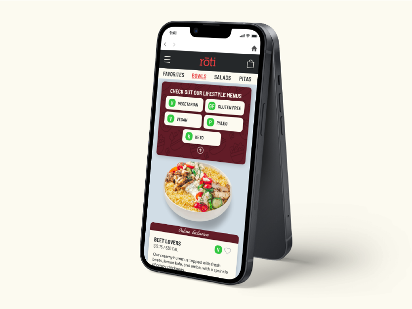
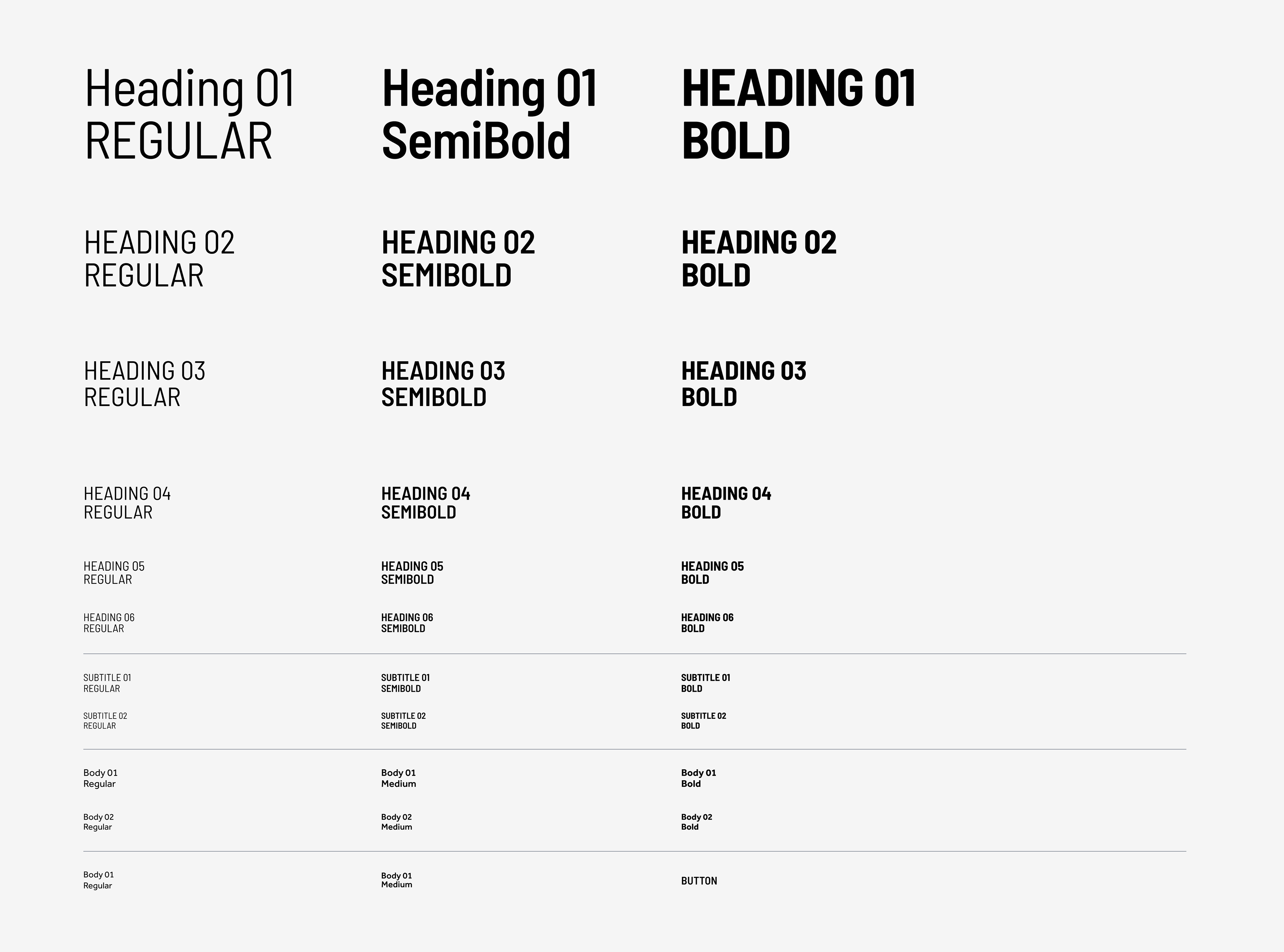
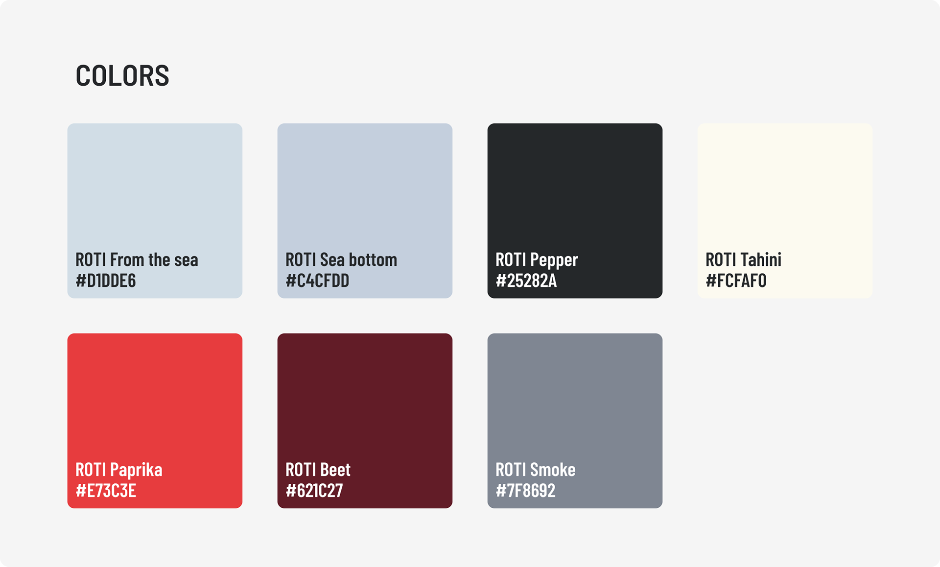
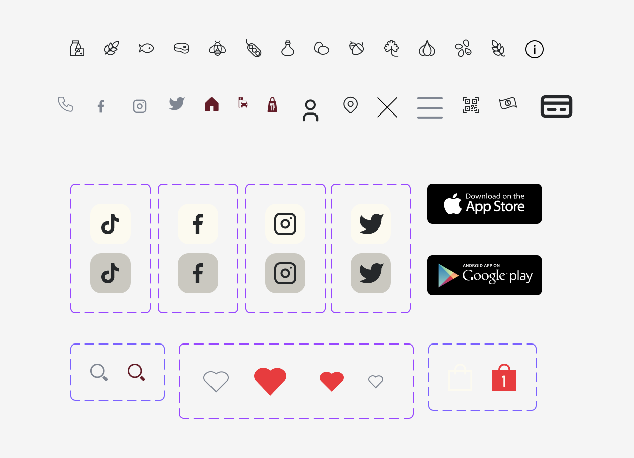
Created foundational atoms (typography styles, color palette, grid system, icons).
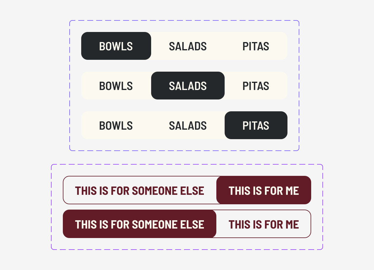
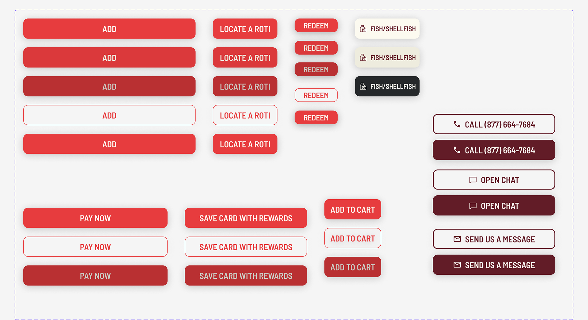
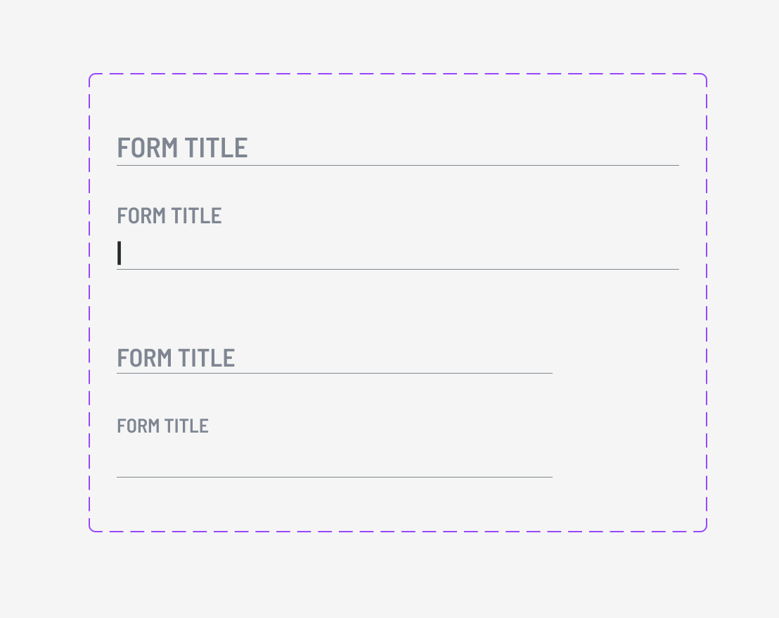
Built molecules (buttons, form fields, navigation items) ensuring alignment with brand voice and accessibility guidelines.
3. Organisms & Templates
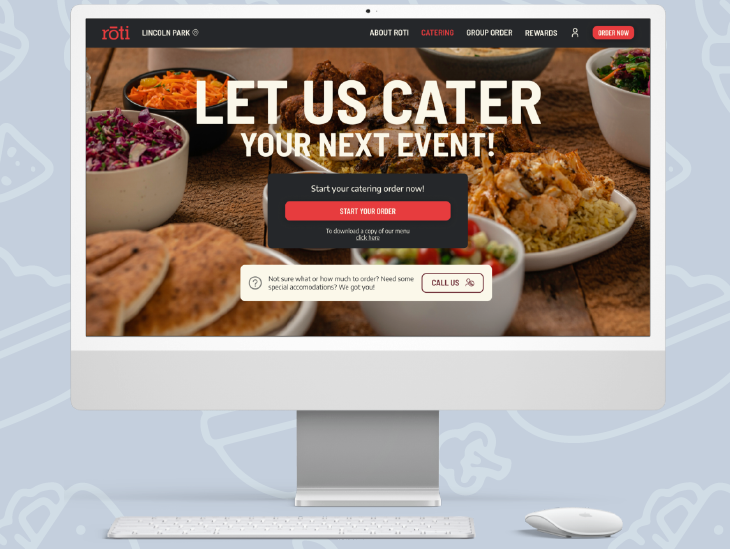
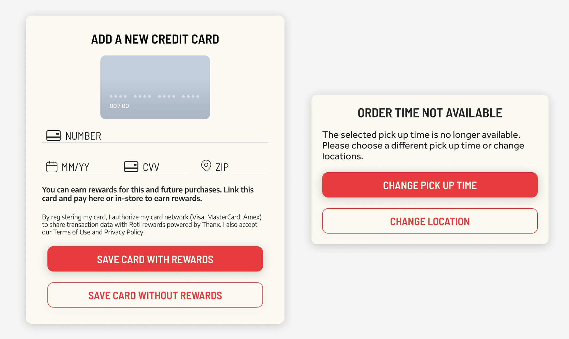
Designed header and footer components, product cards, and layout patterns.
Documented responsive behavior for mobile, tablet, and desktop.
4. Developer Collaboration
Set up a shared Figma library for live updates and version control.
Conducted developer walkthrough sessions to ensure easy adoption.
Solution Overview
The Roti Design System is a comprehensive library of reusable, documented UI components, built to scale with the brand’s evolving needs.
Atomic design methodology ensures clarity and reusability.
Consistent typography, colors, and icons reinforce brand recognition.
Accessible design principles improve usability for all customers.
Final Takeaway
This project reinforced my belief in the power of design systems to not only improve efficiency but also elevate the user experience through consistency and clarity.
By aligning design and development teams with a single shared resource, we created a foundation that saves time, reduces errors, and supports future innovation.
By aligning design and development teams with a single shared resource, we created a foundation that saves time, reduces errors, and supports future innovation.
