Project Overview
The Roti Lifestyle Menu update made improvements on the menu and ordering experience for customers on both desktop and mobile. The scope of this project included designing a way for customers to filter items on the menu to fit lifestyle diets and simply the checkout process.
Role: UI/UX Designer
Responsibilities: User research, wireframing, high-fidelity prototyping, design system integration, developer handoff
Tools: Figma, FigJam, Adobe Photoshop
Responsibilities: User research, wireframing, high-fidelity prototyping, design system integration, developer handoff
Tools: Figma, FigJam, Adobe Photoshop
The Challenge
The Roti Lifestyle Menu & Checkout experience was inconsistent and inefficient across desktop and mobile. Customers found it time-consuming to filter menu items and navigate between order customization, cart, and checkout.
This led to frustration, longer ordering times, and increased risk of cart abandonment.
This led to frustration, longer ordering times, and increased risk of cart abandonment.
Project Goals
Streamline the menu browsing and checkout process for speed and clarity.
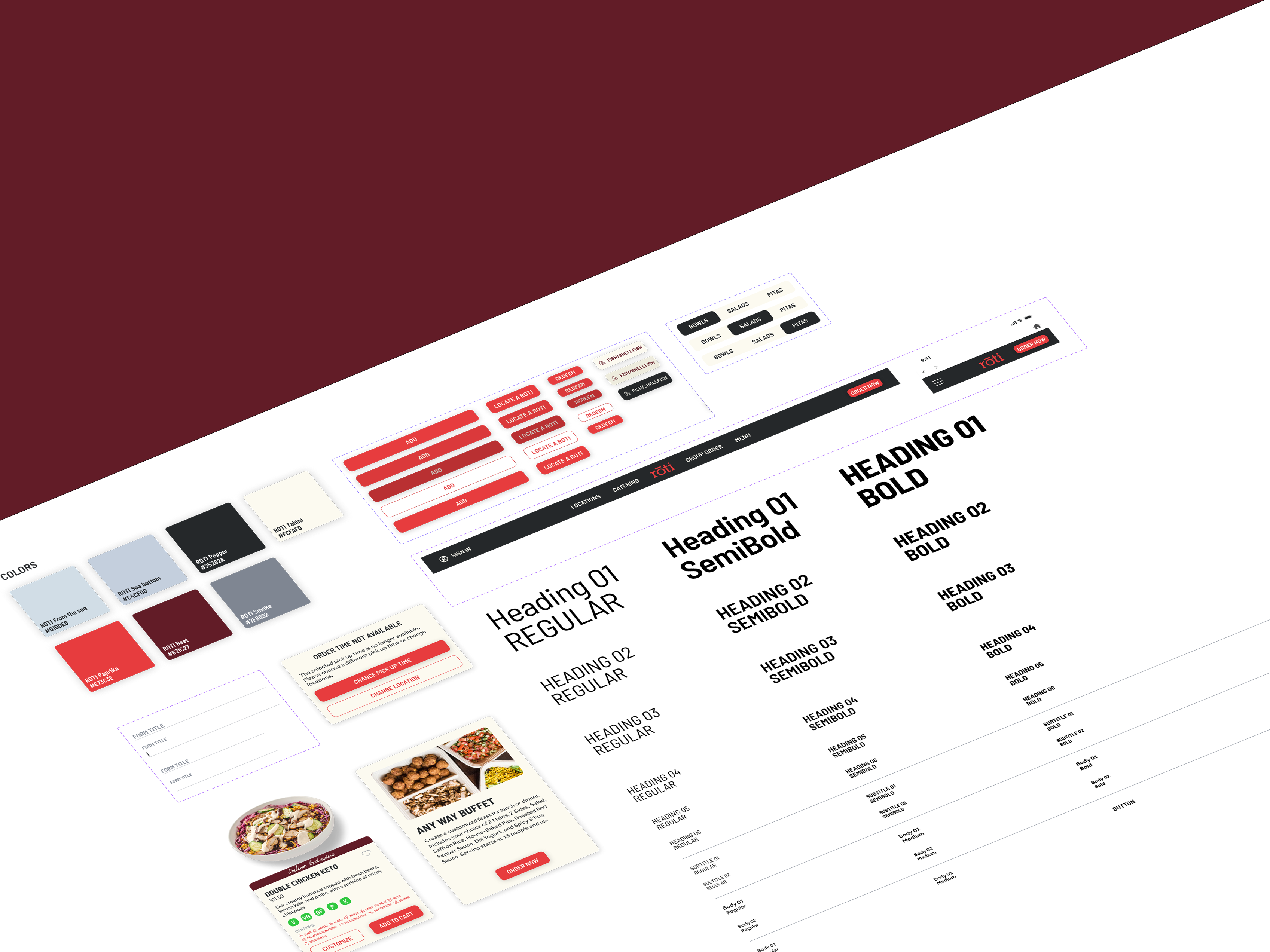
Create a consistent UI across all devices using the Roti design system.
Reduce friction points that caused users to drop off before placing an order.
Ensure the design works seamlessly for both new and returning customers.
Research & Insights
Through feedback from existing customers, analytics review, and competitor analysis, we identified key pain points:
Long scroll times to find menu items
Confusing categorization of meal options
Cluttered checkout pages with inconsistent layouts
Hard-to-find change/edit options during checkout
Design Process
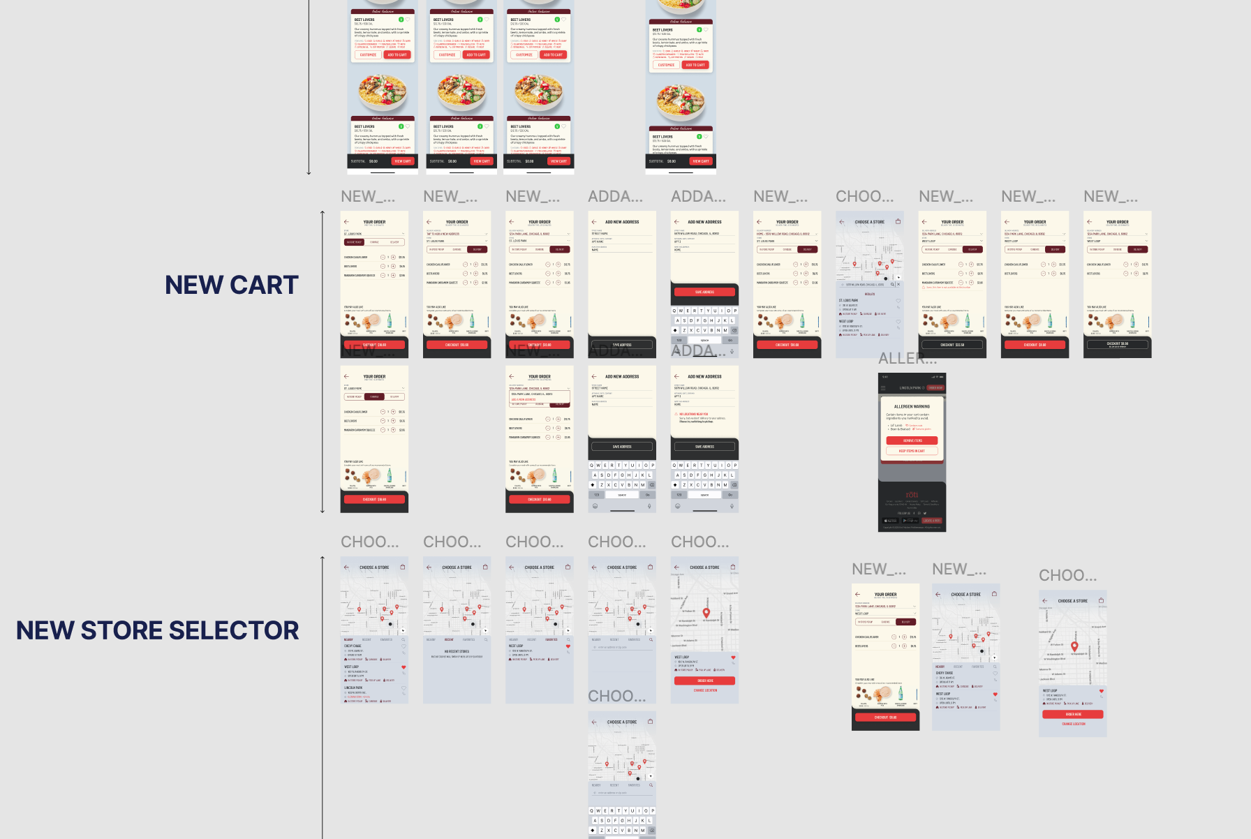
1. Menu Redesign
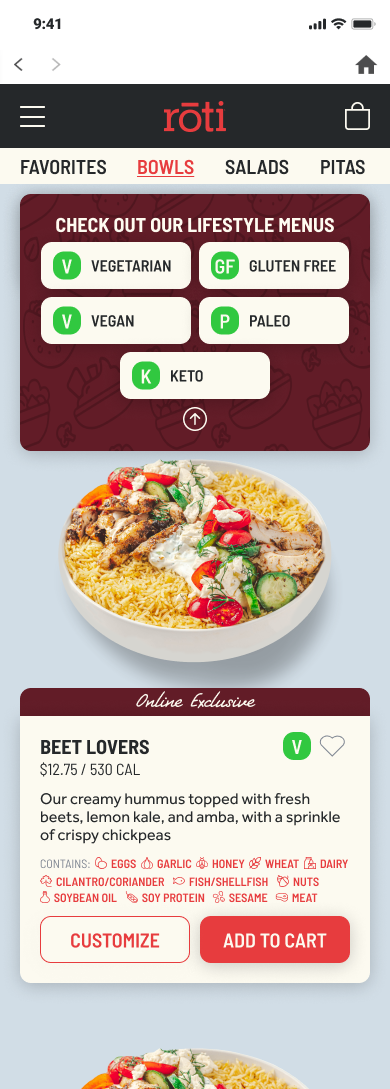
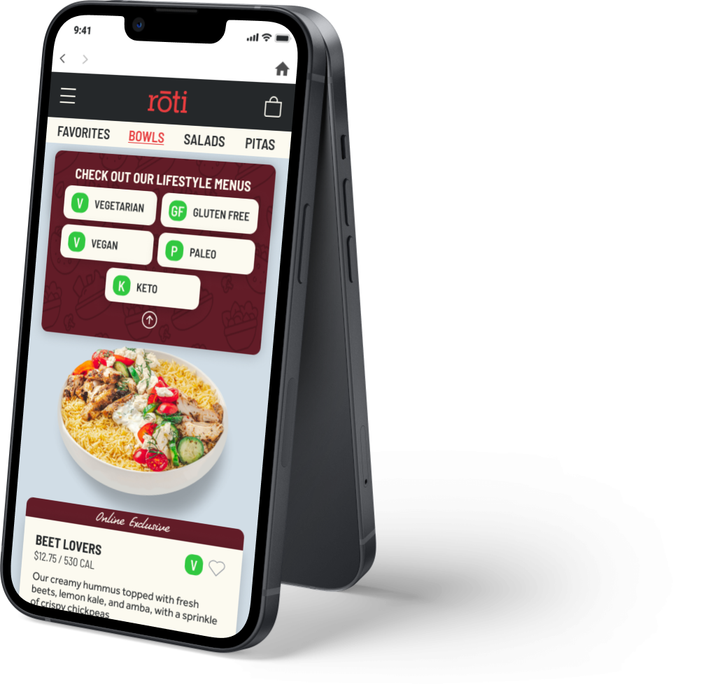
Added category tabs (“Vegetarian”, “Gluten Free”, “Vegan”, etc.) at the top to reduce scroll time.
Used large, appetizing imagery to aid quick selection.
Placed primary call-to-action buttons (“Add to Order”) directly below item descriptions for faster ordering.
2. Cart Improvements
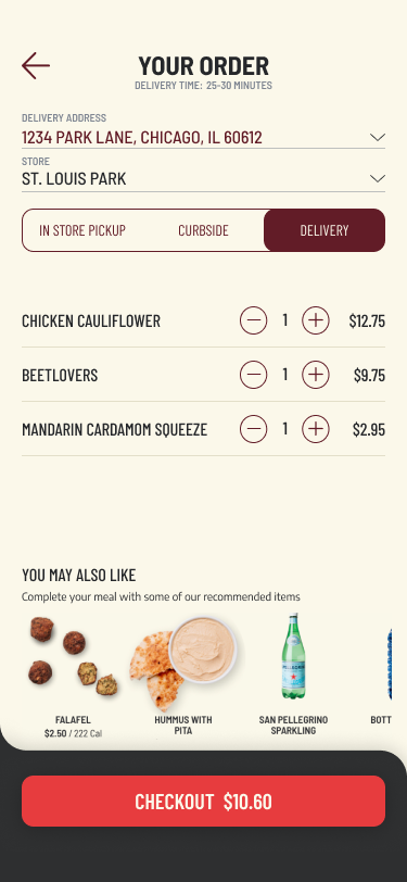
Designed clear order summaries with thumbnail images, quantities, and prices.
Added edit and remove options without leaving the cart page.
Suggested “You May Also Like” items to increase upsell opportunities.
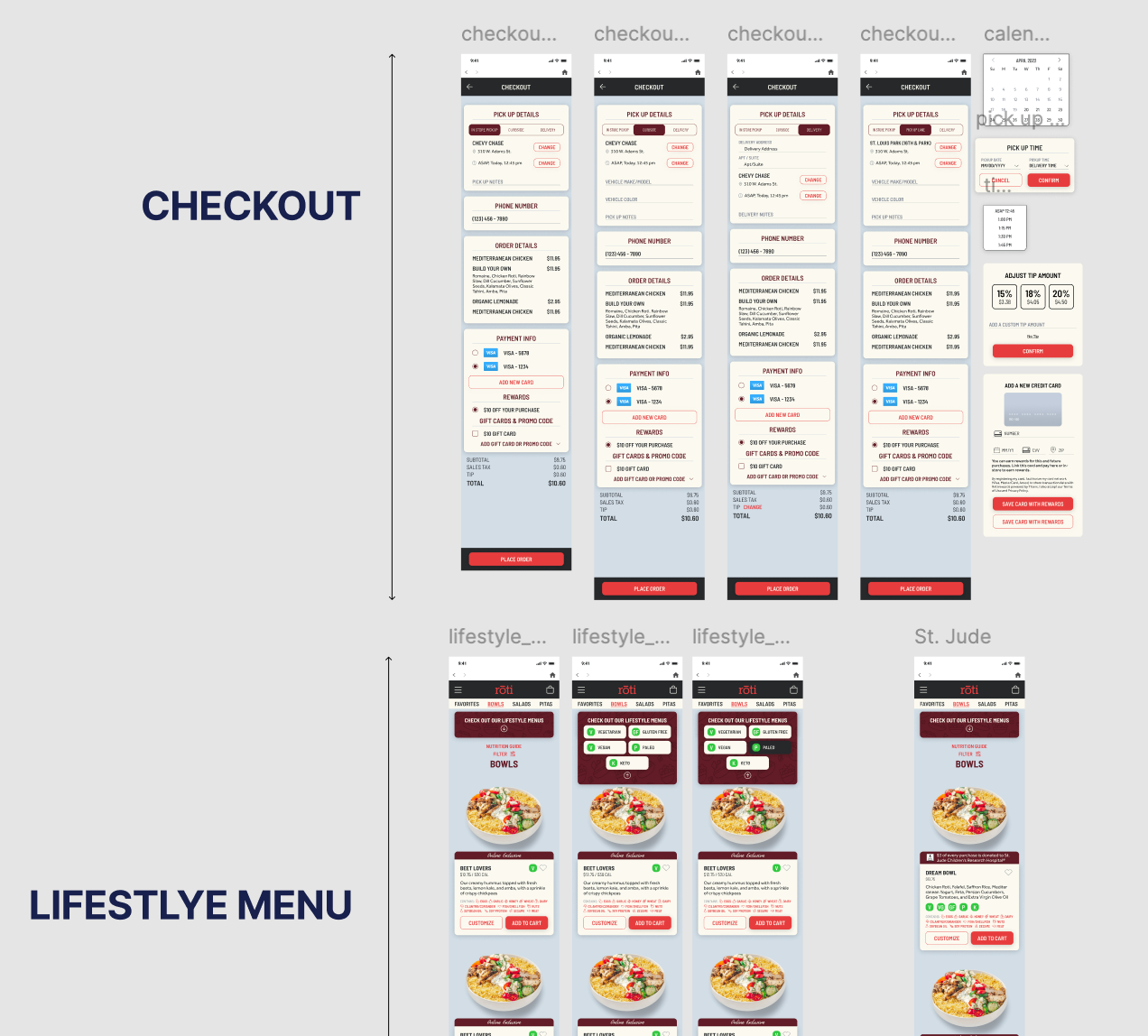
3. Checkout Optimization
Organized information into logical sections: Pickup Details → Contact Info → Order Details → Payment → Rewards.
Used consistent button styles and persistent “Place Order” buttons at the bottom for easy access.
Allowed quick changes to pickup method or delivery address without restarting checkout.
Final Designs
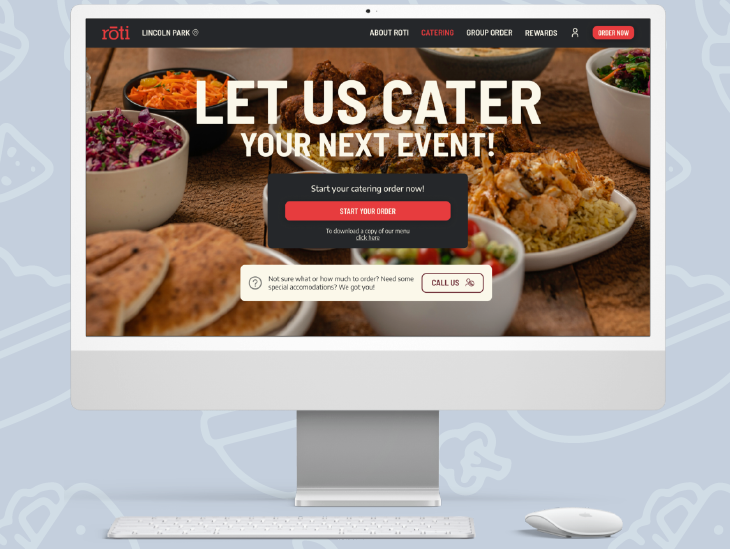
The final design is a mobile-first, streamlined ordering flow that integrates seamlessly with Roti’s brand guidelines.

Final Takeaway
This project taught me the importance of information hierarchy and mobile-first thinking in quick-service restaurant ordering flows.
By focusing on the user’s mental model and reducing unnecessary clicks, we created an experience that feels simple, intuitive, and on-brand.
By focusing on the user’s mental model and reducing unnecessary clicks, we created an experience that feels simple, intuitive, and on-brand.
